Authors, if you want readers to find and buy your book, you have to do some marketing—perhaps a lot of marketing—especially via online media. To grab reader attention, you’ll need graphics, those appealing images of your book coordinated with text and set against an eye-catching background. Sure, professional graphic designers can create amazing book graphics, but so can you. This blog will get you started.
What graphics do you need?
As you develop your platform and marketing plan, create a list of the graphics you’ll need. Consider the following uses:
- images for blog posts
- merchandise
- paid advertisements
- social media banners
- social media posts
- website banners
And consider the following content for your graphics:
- book cover and art only
- endorsement quotes (short quotes from others lauding your book)
- marketing copy (salesy language announcing the launch, sales, editions)
- text quotes (short quotes from your book)
Getting started
Canva is a graphic-design platform for creating visual content. It’s the go-to site for many people who aren’t graphic designers, and the free version is just fine for making book graphics. There are numerous YouTube videos about using Canva, so I won’t attempt a tutorial here, but rest assured it has much of what you’ll need, including templates, backgrounds, fonts, images, shapes, colors, and so on.
You’ll need a high-quality PNG file of your book cover with a transparent background. You’ll also need a feel for what you like and don’t like, so spend some time scrolling social media and author websites.
Tips and considerations for choosing visual style
Personal preference aside, your graphics have to work for your subject matter and audience. Look at the bestsellers in your genre and notice the overall feel and style of the related images on websites and social media (think pink hearts versus bloody knives, cowboy boots versus wingtips, sexy versus wholesome, dark versus light).
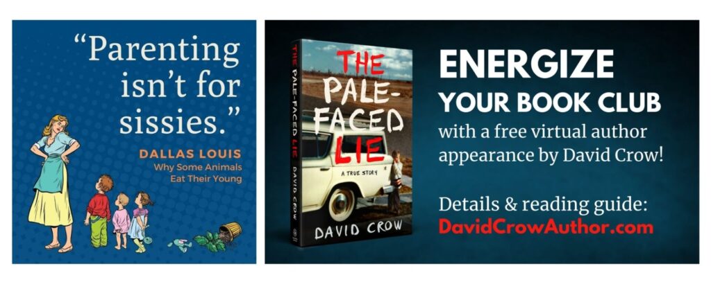
Your background should be just that, a background. It should showcase your images and text but not overpower them or be distracting. Gradients and subtle textures are often good choices. Using a color or pattern from your cover is another idea. If you use a pattern, consider blurring it so it’s not distracting (you can blur an image in Canva). Here are examples of a texture and a gradient:

Your book cover (or cover art) should be on most of your graphics so potential readers see it over and over again. You can use it as a flat image or make a 3-D version that looks more like a book. (You can do this in Canva, but now might be a good time to hire a graphic designer to spend an hour or so in Photoshop to make several 3-D images for you). Consider giving your cover image some depth by using a shadow (available in Canva), a glow (also available in Canva), or making a little shelf for your book to sit on, like this:

Fonts are super important for book marketing. It’s critical that your text is readable, often in just a fraction of a second. You’ll want to do some research about serif fonts, sans serif fonts, font pairings, readability, and what’s appropriate for your genre. (For a Book Brush article on font pairing by genre, click here.)
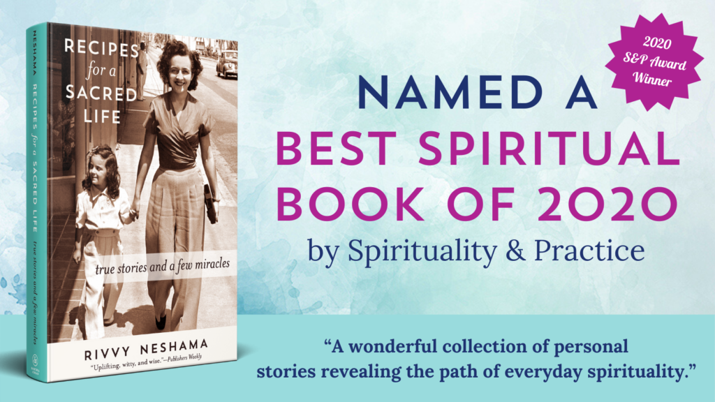
Your text, whether it’s text quotes, endorsement quotes, or marketing copy, should be short. Most book graphics simply aren’t a good vehicle for a lot of text. You can use hierarchy—indicated by font, size, color, and style (such as bold, all caps, italics)—to direct your reader’s attention. This graphic, for example, focuses the reader on the giveaway:

Finally, the size of your graphic is important. Website banners, social media posts, blog thumbnails, videos—everything, really—requires a certain size. I’m referring to the actual width and height of your graphic, not its file or memory size. Instagram, for example, requires graphics or photos to be 1080 x 1080 pixels, which, roughly speaking and depending on your screen, equates to 11 x 11 inches. If your graphic is too small or too large, the platform will stretch or compress it, which will make it blurry.
Ideas for finding photos
In addition to creating graphics with your cover and text, you might also want to use stock photos just as they are. Stock photos are commonly used on websites and for blog headers. Here are three sites where you can get free images: Unsplash, Pixabay, and Pexels.
Another thing to consider is taking your own pictures. Photos of a book in a beautiful setting or among creative or interesting items is a popular trend on some media platforms. Today’s smartphones are so sophisticated that they can take photos that are great for digital use.
Final tricks for great graphics
Making book graphics will take practice and rounds of editing. Two little editing tricks for you: leave a graphic open on your screen and walk away for a period of time. When you come back to it, trust your eye—if something is off, work on it some more. Another trick when you’re not satisfied with a graphic is to simplify it by removing elements rather than adding anything or making it fancier.
Creating your own marketing graphics might seem like a lot to figure out, but you can do this. Many authors aren’t keen on marketing, but this task is creative and fun!
The graphics reproduced in this blog were created by the author and Sandra Jonas. They are reprinted with permission from Sandra Jonas Publishing.

It’s empowering to know you can create some marketing/sales images for free by yourself. Great for self-published or hybrid-published authors—or for those who are traditionally published and doing some local events. Thanks for this info!
This is really helpful! As someone who is not very visual, I learned a lot.
What a helpful article, Jill! As a very left-brained person, I always feel nervous about graphics, but your advice gave me confidence to try Canva.
You didn’t mention Bing images; I have used that source a lot.
Thanks for sharing your knowledge with us, Jill!
Excellent post, Jill. Thanks so much!
Thanks for sharing these ideas! The suggestion to create a 3D book image is interesting and something that might be fun to play around with.
Thanks for this blog, Jill! It reminds me to get back in touch with my “design side.” I’ll definitely look into Canva and will keep your helpful tips in mind.